Chapter:: 08
The Rebuild: Designing the New Era
With lessons absorbed and systems refined, focus shifted toward the relaunch.
Packaging was reimagined with greater precision — cleaner forms, balanced proportions, and a more defined architectural presence. Every surface, edge, and interaction was considered, moving away from decoration and toward intention.
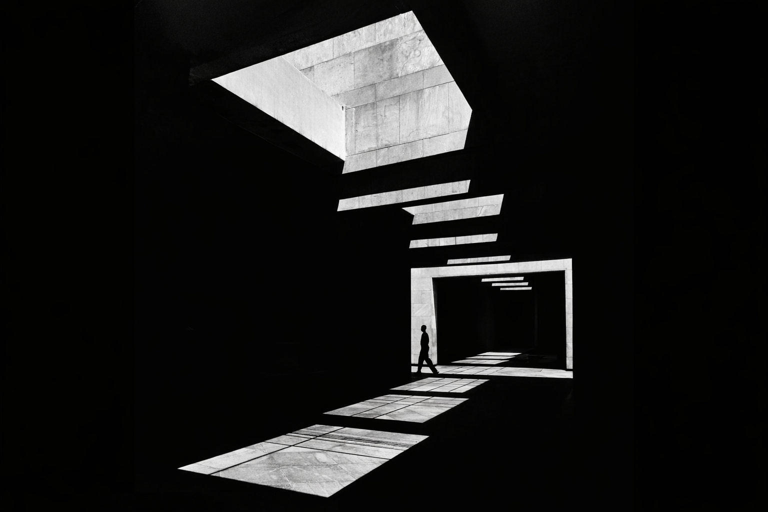
The colour palette became more deliberate. Chrome-inspired finishes, restrained tonal contrasts, and subtle psychedelic undertones were introduced with control rather than excess. Influences from brutalist structures and contemporary design language shaped a visual identity that felt both minimal and distinctive. This evolution wasn’t purely aesthetic — it marked a shift in clarity and confidence.
At the same time, the digital experience was rebuilt from the ground up. The website became more than a storefront — it evolved into a structured environment designed to educate, guide, and immerse. The introduction of the Knowledge Hub established a clear foundation for long-form content, scientific exploration, and interconnected learning. Every page, pathway, and interaction was designed to feel intentional, aligning information with experience.
Across both physical and digital touchpoints, a single principle guided every decision: harmony. Nothing competed. Nothing felt accidental. The rebuild became less about change, and more about refinement — a distilled expression of everything MINDCELIUM had learned, now articulated with greater precision and purpose.